
Player Experience
An Accessibility Baseline for Small Game UI Teams
Start with readable text, distinguishable states, flexible input, captions, and settings that can be verified early.
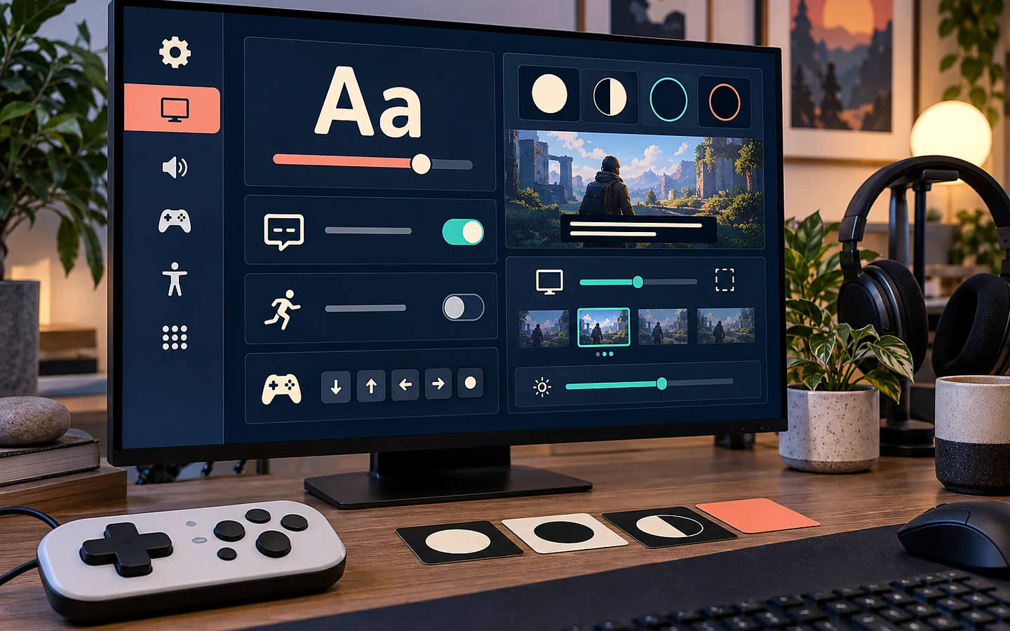
Accessibility is most affordable when it shapes the UI system, input layer, and content pipeline before screens multiply. A small team does not need to claim that every barrier has been solved. It does need a documented baseline, disabled-player feedback where possible, and a way to verify that common barriers are not being rebuilt on every screen.
Begin with player tasks
List what players must perceive and do: read objectives, distinguish allies from hazards, follow dialogue, navigate menus, hold or repeat inputs, respond within a time limit, and recover after a mistake. For each task, ask whether information relies on only colour, sound, fine motion, small text, or one physical input pattern.
The Xbox Accessibility Guidelines are useful design guardrails and testing prompts, but Microsoft explicitly does not present them as a legal-compliance checklist. WCAG is written for web content rather than every game mechanic, yet its principles around perceivability, operation, understanding, and robustness remain helpful for launchers, account pages, and web-based interfaces.
Make text survive real viewing conditions
Test UI at the expected distance and smallest target display, not only on the developer’s monitor. Define a readable default, scalable text where feasible, sufficient line spacing, a width that prevents exhausting line lengths, and backgrounds that preserve contrast over bright scenes. Avoid baking essential text into images because it blocks scaling, localization, and assistive interpretation.
Captions should identify speakers when needed, represent meaningful sounds, remain visible against variable scenes, and give players control over size or background where the platform allows it. Dialogue speed and auto-advance should not force a reader to choose between comprehension and progress.
Do not encode state with colour alone
Selected, unavailable, dangerous, and completed states need shape, label, icon, pattern, motion, or position cues in addition to hue. Simulate common colour-vision differences, then test in grayscale. The goal is not to remove colour; it is to keep the interface understandable when colour information is reduced or perceived differently.
A worked example: the timed selection wheel
Imagine an action game that opens a radial ability menu for two seconds. The selected segment changes from blue to green, a tone rises, and releasing the stick activates the choice. This design combines several barriers: colour-only selection, a time limit, fine directional control, and audio that carries unique confirmation.
A stronger baseline adds a clear outline and label to the selected segment, offers hold/toggle behaviour, pauses or substantially slows the action while the wheel is open, supports directional stepping, and provides visual confirmation of activation. Testing should include stick drift, keyboard navigation, reduced motion, muted audio, and enlarged text. The change may also benefit players using a small screen or playing in a noisy room.
Build flexibility into the input layer
Separate game actions from physical controls so remapping does not require rewriting gameplay. Detect conflicts, allow players to restore defaults, explain reserved inputs, and ensure the settings screen itself is operable with supported devices. Consider alternatives to holds, rapid repetition, simultaneous buttons, and precise pointer movement.
Preserve settings across sessions and profiles where appropriate. A setting that resets before the player can reach the main menu is not reliable. Include accessibility options in the first-run path only when the player can revisit them easily; do not force a long questionnaire before play.
Verify, disclose, and improve
Create a matrix of features, supported platforms, test method, result, and known limitation. Invite feedback from players affected by the barriers under review and compensate specialist evaluation when the project relies on it. Automated contrast or navigation checks catch only part of the experience.
Our recommendation is to publish accurate feature information rather than broad claims such as “fully accessible.” Accessibility varies by player and by mechanic. A concrete list—remappable controls, scalable subtitles, colour-independent objective markers, adjustable camera shake—is more useful and easier to verify.
Sources and verification
Primary documentation checked on 25 September 2026. Product and platform requirements can change; recheck the linked source before release work.